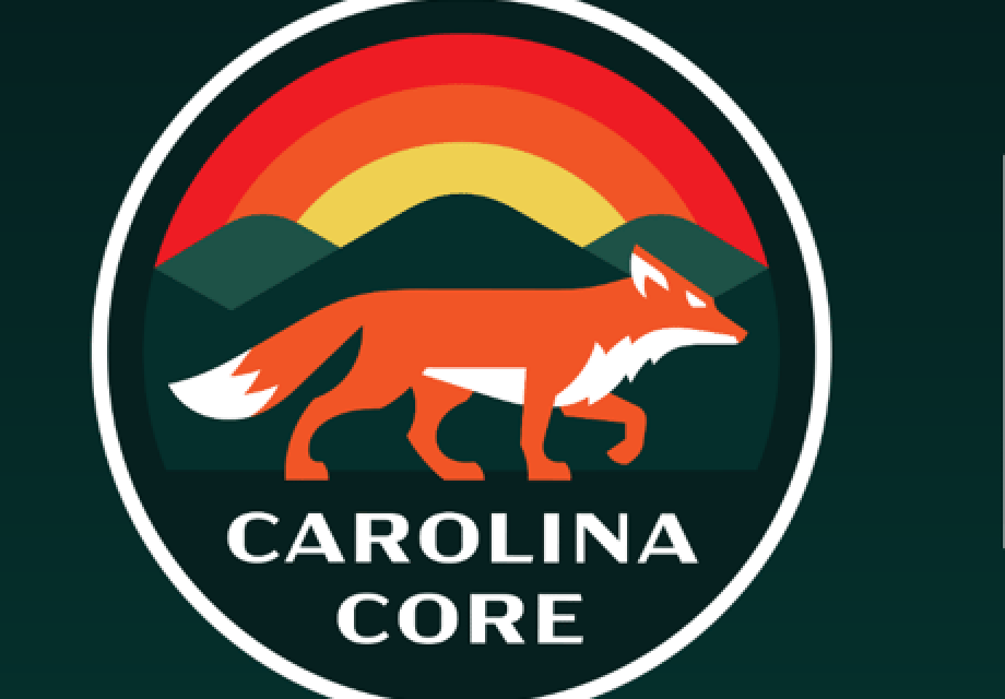
And the answer is: teal, green, yellow, orange, red – and a fox!
The question was: What colors, logo and other branding would the High Point’s Carolina Core Football Club choose as the basis for its identity, merchandise and its publicity efforts.
The soccer team in High Point, which will play in the Major League Soccer NEXT pro league, held a big party in Kernersville on Thursday, Sept. 14 to reveal its logo and branding themes, as well as the reasoning behind them.
Team officials considered the event a big success.
“Our brand launch event was nothing short of spectacular,” a statement from the team read after the bid reveal party. “The passionate energy of our supporters, the vibrant colors that now represent our team, and the vision we unveiled for the future of Carolina Core FC made it a truly memorable day. From the heartfelt speeches to the captivating displays of our new logo and merchandise, the event captured the essence of what we stand for – unity, strength, and tradition.”
The logo, seen above, features a fox in a colorful setting that’s meant to represent the Carolina Core area.
That area is a strip of central North Carolina that economic development officials have given the name Carolina Core and are marketing the area as a single connected region with an abundance of resources that businesses want to see.
Here’s some of the reasoning the team provided for the logo and the colors.
“At the core of our brand is the unwavering commitment to our community, our fans, and the beautiful game of soccer,” the team’s promotional information states, adding:
• The sunset signifies “renewal” with “the beginning of each game as an opportunity for fresh starts and the creation of a legacy of greatness.”
• The mountains that stand together represent “strength and stability,” reflecting “the unyielding support of our fans, players, and community.”
• The red fox – which is the focal point of the branding for the team – symbolizes the spirit of competition.
“This clever and adaptable predator thrives in the Core’s diverse landscapes, both urban and suburban, making it the perfect emblem for Carolina Core FC,” it states.
Team officials added that the choice of colors for the logo hold a deep significance as well. The red represents the landscapes of the region. Teal reflects the beauty of the Blue Ridge Mountains. Green represents “the lush trees and natural surroundings of the Carolinas.”
The use of the colors of yellow and orange were inspired by North Carolina’s beautiful sunsets.

Love it!
I suggest the “Foxskins”.